
Final Back Panel

Initial Planning
|
I'm going to tailor my Back Panel in a format resemblant of the example back panel image on the right, I will include a barcode as well as licensing details in order to improve the authenticity of my Digipak. I will also utilize the centralized column format that the image on the right follows, however I will keep within the styles and conventions of my Digipak and ensure that this panel aligns with the theme of my other pieces of work.
|

|
Panels used for Inspiration (Information for Licensing)
The two images below are back panels for Digipaks whose licensing information I have used as inspiration for my own Digipak's licensing and copyright regulations. The reason the images are enlarged is so you can read the licensing info (seen on the bottom right of both images) and can recognize which info has been used where, within my work.


Stage 1 of Development
|
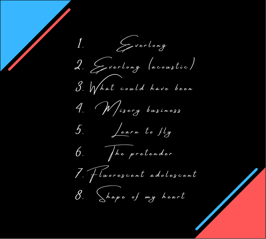
For the first part of designing my back panel, I just needed to list a handful of song names to put onto my album. After this I arranged each of the songs into a numbered column. I increased the spacing between letters and lines in order to make each of the song names easily legible for the viewer.
|

|
Stage 2 of Development
|
I've added red and blue colored triangles in order to add more color to the back panel. The reason I chose red and blue is rather clear, as they are the main colors of my Digipak, and they pretty much directly contrast each other, like black and white, or water and fire.
|

|
Stage 3 of Development
|
I've added a red line next to the blue triangle, and a blue line next to the red triangle. The reason I did this was to show that the two sides were, to an extent, connected. However the fact that the line and triangle aren't actually connected, and that they're of contrasting colors, is done in order to further show the disconnection (which links back to my album's name, "A Hint of Disconnection").
|
|
Stage 4 of Development
|
I've added licensing info on the bottom left of the Digipak panel, in order to build an image of authenticity to my album. I've used info from the example images near the top of the page as examples for company info and copyright regulations.
|

|
Stage 5 of Development
|
I've added a barcode to the top right, and along with that I feel that I've finished my Back Panel. I'll submit this as a draft, however if there's no feedback on how to improve the panel then I'll just issue this as my final piece.
|

|
Large changes
|
Following my change in ideas towards how my Digipak should look, I've made a large set of changes towards my entire Digipak, including my Back Panel. I've changed my list of songs on the Back Panel towards exclusively having songs from Arctic Monkeys. I've changed the corner triangles to both being blue, and both of the complimentary lines next to the triangles have been changed to red. Lastly I have lowered the font size of the production info, as I felt that the size of the text was too large. Overall, everything has changed in this panel except for the barcode.
|

|
Final changes
|
These are the last changes that I felt were needed for my Digipak. I've removed all of the capital letters from my song list, as the letters subsequently clashed with other song names as a result. This makes the list look far neater and satisfying for the reader to view, and ensures that the name of a song isn't misinterpreted or illegible. I have also changed numerous song names on the list in order to specify my Digipak towards a narrower range of audience. Names like "labor day", "scream & shout", and "rehab" align greatly with a younger but slightly matured audience, and names like "Where is the Love" and "This is America" aim directly with more liberal social groups.
|
|
